
I. The Post-Holiday Clearing Moment
Every January, after the holiday decorations are taken off the shelves, the room experiences a brief period of silence. The vibrant reds and greens suddenly disappear, leaving the walls and furniture exposed, like a beach after the tide has gone out. In previous years, I would rush to fill the void with new colors, but this year is different.
Perhaps it’s reached a certain age, perhaps it’s the noise in the news, or perhaps it’s simply a weariness of chasing after things. I’ve begun to crave a quieter, more grounded living space. The living room is the first space to be re-negotiated.
II. Why Pantone Chose White This Year
The 2026 Pantone Color of the Year is called Cloud Dancer—a floating white. Not a cool white, not a creamy white, but a white that lies precisely in between, a white with a sense of breath. This is the first time Pantone has chosen white as its Color of the Year; in previous years, they always preferred saturated, declarative colors.
Reading this news, I suddenly understood this collective yearning. The world is too noisy; people need a visual form of noise reduction. Cloud Dancer isn’t about escapism, but rather a filtering process: allowing the eyes to receive only necessary signals and blocking out unnecessary stimuli.
III. My Winter Living Room Renovation Checklist
Renovations don’t need to be drastic. What I do is more like “editing”—removing a few things, rearranging the positions of others, shifting the room’s atmosphere from “bustling” to “restorative.”
Color: Subtraction
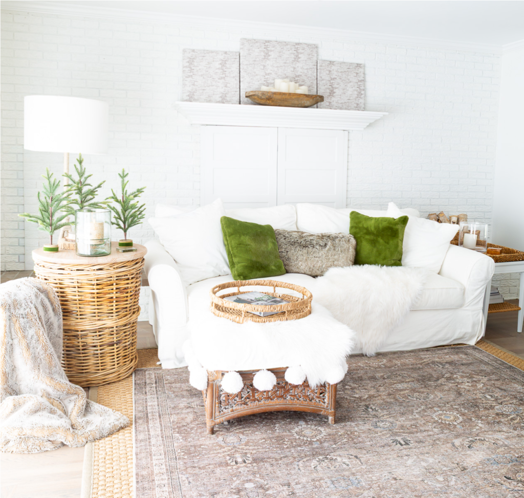
I compressed my color palette to four: white, cream, green, and natural wood brown. All derived from nature—snow, wool, pine needles, and bark.
White sofa covers are a staple. This year, I added two olive green velvet throw pillows, with a gray faux fur lumbar pillow in the middle. Green provides vitality without being overpowering; gray serves as a transition, making the transition between white and green smooth.
Limiting colors doesn’t equal boredom. On the contrary, the eyes no longer need to jump between color blocks, and the visual relaxation is directly transmitted to the nerve endings.
Nature: From Holiday to Everyday Life
The three small pine trees that sat on the wicker side table during the holidays, which I had planned to store away, suddenly became neutral after the red ribbons were removed—no longer Christmas decorations, just three green plants echoing the real pine trees outside the window.
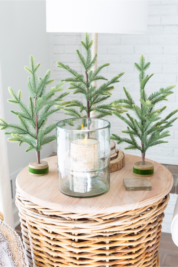
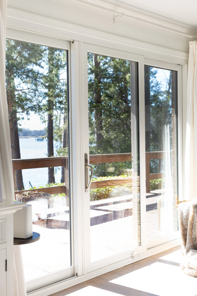
The birch bark candle in the glass candlestick was also left behind. Candles themselves are not seasonal; their warmth is universal. The small pine trees, the birch bark, and the lake outside the window—these three things form a green corridor extending from indoors to outdoors.
Sound: Strings in the Background
Last month, while helping my daughter babysit her grandson in Los Angeles, I played some soft music one afternoon. After the playlist ended, Spotify automatically picked up similar tracks. I noticed the energy in the room changed: my grandson’s play became softer, and the two-and-a-half-year-old crawled to my side and fell asleep hugging a sock doll.
My mother calls this the “Mr. Rogers effect”—that slow, predictable gentleness that makes people let their guard down.
After returning, I started compiling a playlist, mostly string music from the 1960s. Many melodies sounded like background noise from the radio in my childhood living room. Nostalgia itself is a comfort; it reassures you that the sense of security you feel now is continuous with a safe afternoon long ago.
Touch: Textures That Make You Want to Stay
Beyond sight and sound, touch is the third dimension.
The faux fur throw on the white sofa is from HomeGoods. Originally a rug, it suits the sofa better than the floor. A similar one sits on the footstool, its edges adorned with white pom-poms. An open magazine sits on a wicker tray, inviting you to sit down and lift your feet.
Velvet cushions, faux fur, chunky knit blankets—these materials are not just beautiful; they extend a physical invitation: sit down, curl up, stay. Winter nights are long; furniture should be more proactive than people.
Light: Candles and Salt Lamps
After sunset, I try to keep the overhead lights off. Candles are lit in the kitchen and living room, along with a Himalayan salt lamp. Its orange-pink light, unlike the intrusive glow of incandescent bulbs, is more like the lingering glow of dusk, maintaining a transitional state before nightfall.
When reading is needed, only an aged white porcelain table lamp is turned on, its base resting on a round wooden slab. Light leaks from the edge of its linen shade, drawing a blurred circle on the wall.
IV. A Disclaimer Regarding “Correctness”
I must say: this quiet style suits me, but it may not suit you.
Some people need energy and color in winter, needing bright oranges and saturated reds to combat the seasonal melancholy. That’s perfectly reasonable. There’s no standard answer to decorating; it’s only a question of “whether it suits your current state.”
My living room now feels like a worn-out cashmere sweater—not brand new, not exciting, but comfortable, reliable, and something you’d want to return to again and again. If you’re also in a stage of life where you need to quiet down, perhaps these practices can offer some inspiration.